Norlett’s changing logo
May 29, 2016 in Uncategorized
Norlett was a busy company being associated with various importers for a range of petrol and electric powered garden machines. They either had a very good marketing division, or the logo changed as the company moved premises (there’s two or more different addresses for them) or they altered the logo for a new machine or new business deal (Flymo etc) or there was more than one part to Norlett is unknown. Let us know if you can enlighten us any further!
However at least someone was kept very busy in a back room developing a Norlett logo which appears in many different forms over a few short years – more than any other manufacturer I have come across. This isn’t a difinitive guide more of an observation really on a well known name that we all associate with one company and as for the date order perhaps someone may have an answer! It’s surprising how many manufacturers have altered or tweaked their logos through the decades and we, the consumers, never noticed.
So out of curiosity here are the Norlett logos on file displayed all in one place.
There does seem to be quite a few old Norlett badged lawnmowers lurking about, working, rusty or otherwise and the logo seems to have a blade symbol above the name which is pretty self-explanatory for a lawnmower logo.
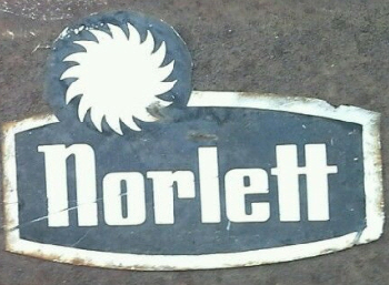
Norlett Lawnmower Logo
Moving on in production, tillers and other machines sported a similar logo but without the blade symbol. Some of these logos appeared with white text on a blue or black or transparent background. Some having black text on a white background too.
Norlett Tiller Logo with blue background
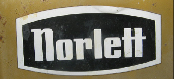
Norlett Logo with white text on a black background
However, Norlett’s logo for the professional range of commercial lawnmowers featured the image without the blade symbol. Have a better look at their full professional advert. The triangular Professional Range logo also appears on the machines too so wasn’t just for advert purposes.
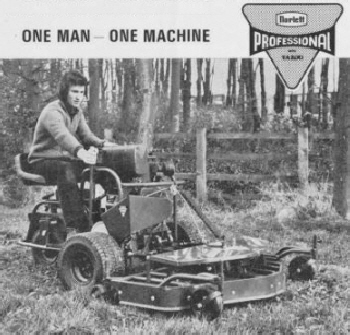
Norlett Professional range advert
Somewhere along the line Norlett decided to have a re-think of the logo, opting for a more modern simple font with a now capital letter N yet still keeping the two letter T’s joined together as in the early logos. These logos are mostly printed on a clear background with white text.
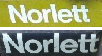
Norlett’s modern logo
There’s a slight deviation when the logo-designer treated the logo to a curved effect for the petrol powered Beaver Powaspade.
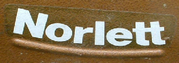
Norlett Powaspade curved logo
And again with the Electric Beaver Powaspade logo.
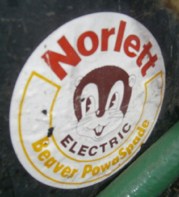
Norlett Electric Beaver Powaspade logo
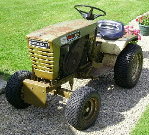
Some of the Norlett tractors (re-badged Wheel Horses) had the logo in all capital letters. White text on black, red or gold to suit the individual tractor.
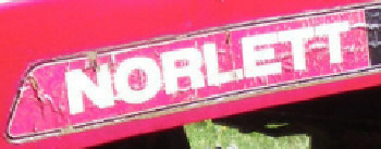
Norlett tractor logo
The tillers also had a more modern logo in the end with all capital letters.
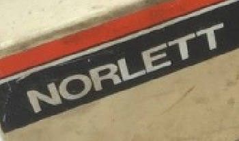
Norlett tiller logo
Let us know if you can add further to this or can correct anything.
said on September 15, 2016
I have a Norlett machine (a brush cutter I think) it has Silver Cross type pram wheels and a Tecumseh Italian engine with a different label to all those above. I have sent a photo to “what is it?” but not sure how to post photo’s here.